I'm Meghan — sole designer and PM Lead at a B2B security startup. I own UX end to end and drive product direction — partnering with engineering and leadership to turn ambiguous problem spaces into clear strategy and shipped experiences. I'm at my best in the messy, undefined front of a project — turning "we're not sure what this is yet" into something clear, shipped, and genuinely usable by the people who need it.
Currently open to IC Product Design or hybrid PM/design roles
Five case studies from Spec — a B2B SaaS security infrastructure startup. Research-driven 0→1 builds spanning investigative tooling, information architecture, data visualization, and self-service features. 2023–2026.
Product Designer & PM Lead · Spec
Currently open to IC Product Design or hybrid PM/design roles
I'm the sole designer and PM Lead at Spec, a B2B security infrastructure startup, owning UX end to end from problem definition through shipped feature. My pivot to product design was shaped by years of managing projects and small businesses — which left me fluent in stakeholder alignment, empathetic to the demands of customer experience, and permanently allergic to solutions that ignore how the business actually works. Growing up in the arts is probably why I can't shake the belief that UX isn't fundamentally a digital problem — it's a human one.
A perpetual student of the craft, I bring an instinct for clarity, a builder's eye for what's feasible, and a pull toward the parts of design you can't see.
Digital products should exist to give us more time back in the real world.
As for my real world: I'm a New Orleans native who enjoys good music, good company, and good cooking. When I'm offline, you can find me teaching Ballet, learning about photography, and coaxing the garden through a zone 9 summer.

Drop me a line. I like knowing what people are working on, even when the timing isn't right.
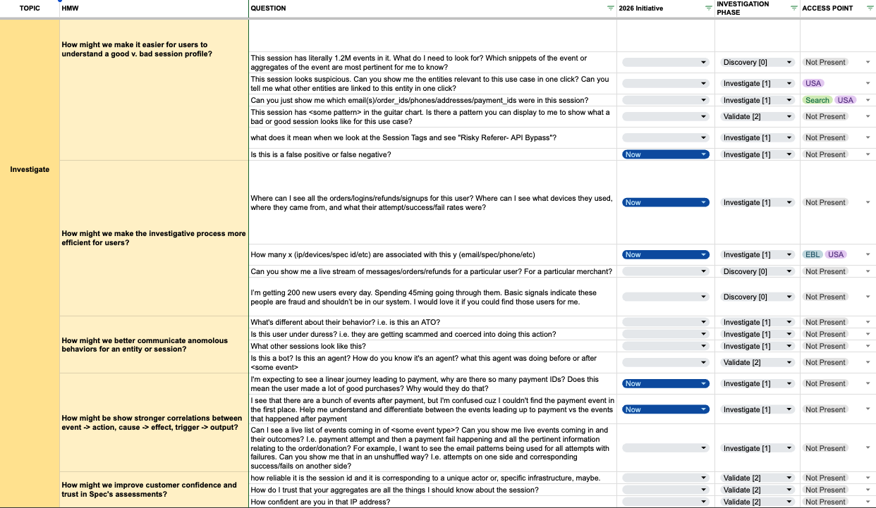
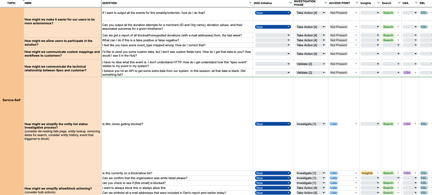
meghan.m.thomas@gmail.comOverhauling the primary investigative surface for fraud analysts — cutting the distance between knowing what to look for and being able to act on it.

Made the entity profile the investigation hub — analysts go from a lead to action without leaving the page, across four milestones.
Reviewed archived client call recordings to extract verbatim pain points.
Spoke directly with Product Success — the client liaisons fielding daily Slack questions. They were the closest proxy to client frustration and the first to hear what the product couldn't do.
Grouped quotes across both sources into clusters, identified where themes overlapped, and zeroed in on the EBL (Entity Behavior and Linking) experience as the highest-leverage surface to fix first.
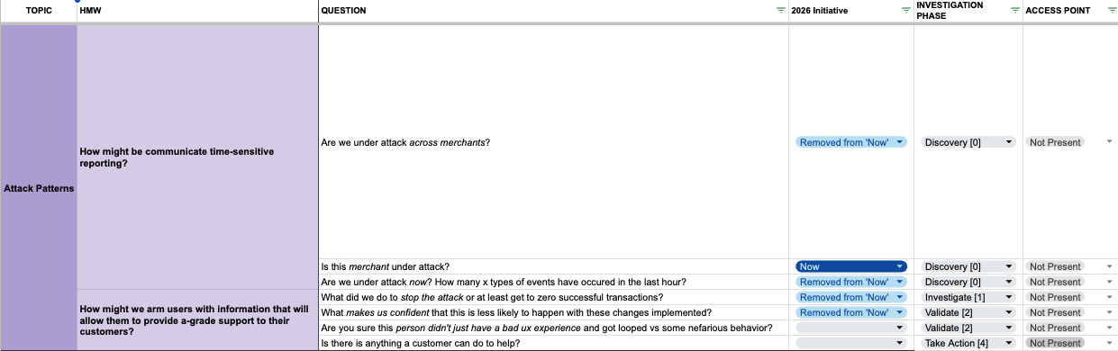
"Where can I see all the orders for this user?"
"How many devices are associated with this email?"
Fraud analysts came to the product knowing exactly what they needed to do. The product wasn't helping them get there.

Working from each how-might-we question, I roughed out layouts, color cues, and hierarchy — using this project to try Figma's MCP with Claude for the first time.


AI takes the tedium out of ideation, but it doesn't replace the designer — you trade managing yourself for managing an IC, one only as good as the direction you give it. Used with intention it's a genuine additive; left unchecked, you spend your time fixing its output instead of sharpening your own. That said — I'm all for working smarter, especially at early-stage startups where you're accountable for a wide surface area. I'm excited to keep folding it into how I solve problems for the business and the customer.
The exploration converged on a single idea: any entity should be reachable from anywhere, and once there, every action should happen in place. A persistent global search became the entry point; the entity profile became the hub where status, history, events, and relationships all lived — no navigating away to act.

Rather than waiting for the full redesign to be complete, the project was structured to ship value incrementally. Work began end of March — each milestone unlocked a new capability while the next was in development.
Entity profile activity was capped at 90 days — not arbitrarily, but to keep ClickHouse costs down. With the volume of event data Spec stores, constant large queries added up fast. The problem: 90 days often wasn't long enough to establish behavioral patterns across Spec's customers' own users.
Rather than simply lifting the cap, the fix kept the cost-conscious 90-day default and put control in the user's hands — an optional window extending up to 365 days from the search date. Customers who needed deeper history could reach for it; everyone else stayed on the lightweight default. It gave the page purpose, handed users agency over their own investigation, and delivered a table-stakes capability they expected to find. From conversations with analysts and PS, most rarely needed to search past two or three quarters — so 365 days was a deliberate test boundary, enough to validate real demand before expanding or restricting further.


Every EBL displays a status chip — Allowlist, Blocklist, or No List — editable in place. Update it in EBL and it updates in Lists. Update it in Lists and it updates in EBL. The same status treatment carries through every table, search result, and flyout across the product.


A static search bar in the side nav lets analysts look up any identifier without leaving context. Live suggestions surface as the analyst types; one click lands directly in the right profile — no intermediate page.
It's arguably the highest-leverage unlock of the whole initiative — so why M3 and not M1? Dependencies. Given the sheer volume of data Spec collects, a true global search would have been prohibitively expensive to run, so I worked with the PS team to scope it to a semi-global lookup on key entities — keeping back-end costs in check. That still required a new search table the platform team had to build first; only once the data was exposed could the front end wire up the lookup. I sequenced lighter-lift milestones ahead of it to work around the dependency, landing it as early in the release as the chain allowed.


Events broken into four tables — Payments, Refunds, Logins, Signups — each with tailored columns and aggregate breakdowns. A new event_context field lets PS teams add plain-language explanations to failed events.


A node graph surfaces first-degree connections grouped by identifier type. Node size scales with volume. Selecting a node filters the linked entities table and updates the event volume chart live.
This wasn't the first attempt — an earlier relationship graph existed when I started, and it had been scrapped for good reason: nodes drifted around the canvas when selected, the iconography and color noise buried any pattern, and instead of lifting work off analysts it created more. The rebuild was a series of deliberate corrections — scope the links to first degree, strip the palette down to cut the noise, lock the nodes static, and scale each by its number of associated events so volume reads at a glance. The graph then hands off to the parts of the page that do the real analytical work: event aggregates, timeline details, and click-throughs into event search for deeper digging.


Two features were explicitly cut — not because they weren't valuable, but because the conditions to build them correctly didn't exist yet. Scoping isn't just a dev decision; it's a design decision.
Cut on engineering scope and flagged for revisit after launch — recalibrated to whichever clients were actually onboarded by then.
This had to be solved at the session level first. Surfacing it in the profile before that upstream work landed would have shown clients false confidence.
The full profile build-out didn't reach clients before the initiative wound down — but the highest-leverage, lowest-lift pieces did: extended history, direct lookup, and inline list management. The problems were well-defined and the expected impact was clear.
"Awesome!! We have made so much positive progress in such a short amount of time across the board. It's been crazy!!"
Making Spec's "seamless and proactive" promise visible — by giving users the first real view of what's actually happening across their customer environment.

Cut customer onboarding from roughly 2 weeks to 12 hours by replacing guess-and-check configuration with an automated, visual route table.
Spoke with the Product Success team who owned every new customer deployment. Their workflow was manual and speculative — deploying catch-all specs to discover what was there, then reconfiguring once they had data. They couldn't be confident a site was adequately spec'd without hours of testing.
Sales was consistently pitching Spec as "seamless" and "proactive" — but had no product surface to point to. The proactiveness existed only in process, not in the product itself. The gap between promise and evidence was a real sales friction point.
Mapped the steps PS took to configure a new customer environment. Without visibility into what routes existed, every deployment started from zero — building a mental model of the customer's API surface through trial and error rather than direct observation.
"Guess and check. Every time."
You can't configure what you can't see. PS was deploying blind just to learn what was there — so the first thing to build wasn't the config tool, it was the ability to see at all.
Configuring Spec's event catalog meant mapping URIs, headers, query parameters, and body criteria for every route worth monitoring. The problem: there was no way to know what routes actually existed in a customer's environment — or what data was present in any given request or response.

The project was structured around a clear priority order: surface everything first, then give users the tools to act on what they see. Route discovery had to work reliably before route management could mean anything.
The Site Sentry home view is a route table — one row per route key, automatically populated by sampling the proxy. Each row surfaces the route key, sampled call rate, a 7-day velocity visualization, and the associated spec name and event type if one has been deployed. ID-heavy paths are algorithmically compressed into wildcard routes, and irrelevant routes are filtered by MIME type and HTTP verb before they ever reach the table.


Clicking into any route opens a detail view with the full picture: velocity history, spec name and event type, a breakdown of the route key (URI, query parameters, headers, body), and a sample request and response from the actual customer environment. This was the answer to the question PS had been asking manually for every deployment — what data is available on this route?


Site Sentry isn't a read-only view — it's a working surface. PS can full-text search across all routes to check for specific cookies, headers, or form data keys. Routes can be split by adding match criteria that distinguish one variant from another, or merged via wildcards when ID segments clutter the table. When a route is ready to become a spec, match criteria can be exported as JSON and fed directly into the spec catalog — no transcription, no translation.


The sampled call rate for any route doubles as an insertion rate estimate — telling PS teams roughly how many events a new spec will generate before they commit to it. This closed a key gap in the configuration workflow: teams could now validate the scale of new coverage before deployment, rather than discovering it after the fact.


Two capabilities were explicitly held back from this release — not because they weren't wanted, but because they would have created fragility or set the wrong expectations at launch. Visibility and trust had to come first.
Promoting Route Key Specs into native Specs would have blurred a meaningful distinction in the data model. Keeping them separate at launch meant users understood what they were working with — and the upgrade path could be designed deliberately rather than bolted on.
Onboarding-time range per the Product Success team's lived experience.
Site Sentry replaced a manual, error-prone onboarding process with an automated, visual one. Customers get immediate visibility into what's happening across their environment on day one. PS teams get a surface they can trust — and for the first time, the product could demonstrate its own proactiveness rather than have someone explain it.
Putting list management directly in clients' hands — because a time-sensitive block can't wait for the next available member of the Product Success team.

Put all 20 allow and block lists in clients' hands — removing the PS-team bottleneck and making time-sensitive blocks possible in real time.
Spoke with Product Success — the client-facing liaisons who fielded every list update request. They described a steady stream of inbound Slack messages that had nothing to do with their actual expertise: "Can you add this email to the block list?"
Reviewed the types and frequency of list-related requests routed through PS. A disproportionate share were simple, repeatable updates — the kind clients were fully capable of making themselves if the product let them.
Fraud operations move fast. Mapped the gap between when clients needed to act on a bad actor and when the PS team was available to action the request — making the cost of the bottleneck concrete.
"Can you add this email to the block list?"
Clients knew exactly what they wanted to block. The product just wasn't letting them do it themselves.
Clients who needed to update their allow or block lists had one option: submit a request to Spec's Product Success team and wait. For routine list hygiene, that was an inconvenience. For time-sensitive fraud operations — a known bad actor appearing in real time — it was a genuine operational gap.

The core of the work was structural. All twenty list types lived only in a backend JSON config — there was no client-facing UI at all; consolidating them into a single, filterable hub under Model Settings was the decision the entire feature hung on. Close work with the PS team — who fielded these requests daily — informed how the lists were grouped and surfaced in the new structure.
The feature was scoped as a single release targeting the core self-service loop: find the right list, make the change, confirm it happened. Each capability built on the last — the hub made the lists visible, entry made them editable, validation made editing safe, and the log made it trustworthy.
The lists manager now lives in a Model Settings tab (the start to a self-service UX which will eventually hold other self-service actions) and opens to all 20 allow and block lists displayed simultaneously. A filter panel on the left lets users search by list name or by values within lists — so finding a specific entry across all lists takes seconds. No toggling between tabs. No hunting through menus.


Adding entries was designed to support both the single-value case (one email to block right now) and the batch case (a report of 200 suspicious IPs). Users type a single value or paste a comma-separated list directly into the input field and press Enter. Both paths feel the same — no separate import modal, no file upload flow required.


Validation catches duplicates across lists and format errors where the element type has a consistent format to check against. Entries are not case-sensitive. But the system is transparent about its limits — some element types, like zip codes, vary enough by country that format validation would produce false negatives. For those, the product doesn't attempt validation it can't do reliably.

The Change Log sub-tab gives clients a full history of every modification. Each line item represents a save event — so if a user updated three lists in one session and hit save once, those changes appear grouped together, reflecting how the action actually happened. Especially valuable in multi-user environments where multiple team members have access.

Nothing here was a hard cut — the discipline was the opposite: holding a tight scope so v1 could ship fast and prove the core loop (find the list, make the change, confirm it) before anything else got layered on. These were the lines drawn deliberately, to be revisited once real usage showed which ones actually mattered.
Paste-and-go covered bulk entry well enough to ship. A file uploader sounds obvious — but "obvious" is just an assumption until someone actually hits the wall. Let real usage ask for it.
The PS team had been fielding list management requests as a matter of course — a low-complexity, recurring task that took up availability they needed for actual client work. Handing that control to clients didn't just unblock them. It freed the team to focus on the work only they could do.
In data-heavy products, color isn't decoration. It's how users understand what's happening.

Replaced 50+ disconnected values with one intentional system — a 12-color chart palette and five semantic states, built across 8 months and a mid-project rebrand.
Color was one layer of a broader audit covering IA, interaction design, styling, and typography. The audit made it impossible to ignore: 50+ disconnected hex values, no shared language, no documented rationale for any individual choice.
Two sources shaped the approach. Paul Tol's color theory research gave a framework for navigating this as a designer without a deep color theory background. Viz Palette — a tool that tests color sets in real data visualization contexts — showed where shades were too close to distinguish and flagged accessibility gaps that a color picker would never catch.
Colors were tested directly in data visualization examples — not swatches. This was the only reliable way to know whether values that looked distinct in isolation would stay distinct at the sizes and densities they'd actually appear in.
What's mathematically distinct isn't always visually distinct — the eye doesn't read hex codes. Twelve "unique" colors can still collapse into a blur of blues, so the real job was optimizing for perception, not math.
The product had accumulated over 50 disconnected hex values across charts and UI elements without systematic organization. As the charting surface expanded, the inconsistency compounded — each new visualization made its own color choices, with no shared language to tie them together.


The work unfolded over eight months in three distinct phases — each one building on the last, and one of them responding to a surprise mid-project rebrand. What started as a color audit became a full system, and then had to be rebuilt around a new brand anchor before it could ship.
Color was one piece of a broader product audit covering IA, interaction design, styling, and typography. On the color side: every value in the product was catalogued, the inconsistency documented, and then a real research phase began.
I initially thought I needed 15 colors — after testing with Viz Palette and working through Paul Tol's color theory research, I landed on 12, including Spec's brand blue as the anchor. The research phase was extensive and essential — this wasn't territory I had deep color theory experience in, so I built the foundation before making decisions. Accessibility was a core part of that exploration: Viz Palette simulates how color sets read across different types of color blindness — deuteranopia, protanopia, tritanopia — and flags pairs that become indistinguishable. Several early candidates that looked strong in isolation failed those checks entirely. That feedback loop was what made the tool so valuable; it caught issues no swatch review would surface.


With the chart palette established, the next layer was semantic: a set of colors that would communicate risk and informational states consistently across the product. Five states — red (malicious), yellow (suspicious), green (good), grey (neutral), blue (secondary informational). Yellow was the hardest. It had to read clearly as "suspicious" without veering into orange or washing out into something too bright to be taken seriously. Getting it right took significant iteration, but landing on a yellow that was unambiguously moderate risk — not too orange, not too light — was one of the most important decisions in the whole system.
I tried and tried and tried again. The palettes that came close to being greenlit kept running into the same wall — too similar to a competitor, or too close to another well-known product. Which raised a harder question: how do you differentiate without diverging for its own sake? Being different just to be different isn't design — it's noise. And noise, in a data product, is the last thing you want. At the same time, if a palette works, if it's accessible and legible and users already understand its language, is replicating it actually wrong? That was the quandary. There's no clean answer to it, which made it one of the most genuinely difficult parts of this project.
Where we landed: anchor to meaning. The risk and status colors didn't need to be original — they needed to be correct. Green means good. Red means bad. Yellow means watch out. Those associations are too deep to fight, and fighting them in the name of differentiation would have made the product harder to trust. The distinctiveness came from how the system was built around those anchors, not from the anchors themselves.


Midway through the project, a surprise: Spec rebranded with a new brand blue and purple. The palette had to go back to the drawing board. The goal expanded — not just update the chart colors, but build a full color system: 8 main color families (red, orange, yellow, green, blue, purple, pink, grey) with stops up and down from each main to support future dark mode. Brand blue and purple were subbed in directly. Grey was edged toward Spec's blue tones to keep blacks away from true black. Red and green carried over from the risk color work in Phase 2. The one exception: the risk yellow stayed protected — it had taken too long to find and was too precisely calibrated to risk touching. A distinct orange and yellow were drilled into separately for the chart palette. Four accent colors (for chips, icons, categories, future product features) were also defined as part of this phase.
With the expanded palette defined, the same validation process from Phase 1 ran again — every color put through Viz Palette to check for distinguishability and accessibility issues. The rebrand had introduced new values that hadn't been tested in data visualization contexts before, so this wasn't a formality. New blue, new purple, adjusted neutrals — all of it needed to hold up at small sizes, in overlapping series, and across the range of visual impairments the tool flags. Some colors needed nudging. Some passed cleanly. The color report became the documentation of what was intentional and what was a known tradeoff — so future decisions could be made with context rather than from scratch.


A color system without usage guidance is just a swatch set. The output of Phase 3 included how each color category applied across UI contexts — backgrounds, borders, icons, text — with clear rules for where each role belonged. This layer also laid the groundwork for a future dark mode: the color stop structure across each family was designed with that in mind, so it wouldn't require starting from scratch when the time came.


Two pieces were deliberately deferred — not for lack of value, but because the timing wasn't right. The system itself shipped complete; these were the extensions left for the moment they could land with full impact.
The existing chart palette was good enough to hold, so the overhaul was deliberately paused — better to fold it into the eventual redesign of the Insights experience and its core charting aids than to rebuild the chart colors in isolation.
A matter of time, not priority. The system was fully defined in Figma; codifying it as tokens in code was slated to build with the front-end team during the next innovation week.
Before this work, every chart made its own color choices. After, every chart pulled from the same intentional framework — built around brand, tested for legibility, and documented for future contributors to build on without having to reinvent decisions that had already been made.
The absence wasn't data. It was meaning. Turning a powerful but passive analytics surface into one that surfaces what changed — before users even know to ask.

Gave users context on day one — surfacing meaningful change automatically across 3 phases, from a curated insight list to fully clickable charts.
Product Success had deep knowledge of the most commonly investigated sessions, watched trends, and the patterns that mattered per customer. They were the only ones who knew what "interesting" looked like — and that knowledge lived entirely in their heads, not in the product.
Users arriving at the Hub for the first time had no way to understand what was happening on their properties without a specific question in mind. The product rewarded expertise it couldn't yet assume. There was no "here's what's going on" starting point.
Most charts in the experience were dead ends. Only the Session Volume Timeline allowed click-through to search. Every other chart — bar, doughnut, line — required users to manually reconstruct the query in a separate search experience. A second audit surfaced this as a critical gap, especially for Security teams with lower tolerance for friction.
"They are great examples of why we need to make the product clean for clients. They will actually be using it."
The product could answer almost any question a fraud analyst or security team wanted to ask — but only if you arrived with the question. That core gap — a powerful tool with no guidance — surfaced in three different ways over three years, and each became its own phase of work.
The original Insights experience — powerful, but it required you to arrive with a question.
The Insights experience launched in 2023 as a standard surface giving new users immediate context on their properties. A second phase expanded beyond session-centric data into custom, PS-configured, per-customer dashboards built around events and entities — speaking in the language customers actually used. A third phase closed the biggest remaining gap: charts that couldn't be clicked into for query analysis.
The foundation. Before Custom Dashboards (2024) and chart click-through (2025) could build on it, the core experience had to exist: a starting point assembled from the PS team's knowledge of what mattered to each customer. What follows is that founding effort, end to end — explore, converge, ship.
With the PRD in hand, I moved into the design space to make sense of it — roughly translating requirements into Figma, pulling screen inspiration from products solving adjacent problems, and pressure-testing how the insight cards and overall layout could come together. The goal was to explore widely before committing: how insights should be grouped, what belonged on the first screen, and how each metric should read at a glance.


The exploration converged on a deliberate narrative arc — the broadest view at the top, narrowing down to the most granular. At this time, the product was communicating user journeys at the session and lightly at the event level. Every chart became a doorway into the underlying data for each use case that was sold to the customer in the form of 'modules'.

From there the structure resolved into concrete wireframes, then got checked against the original experience to make sure nothing in the PRD was lost.

Lo-fi user flow — the full path from insight list through overview and detail, out into search.


The experience shipped as a single progressive drill-down. The Insight List grouped session and event trends, each showing its week-over-week change and a 7-day trend — color-coded so problems read red and wins read green. Clicking an insight filtered the Session Volume Timeline to the relevant sessions and events in that use case.

States — the loading, empty, and populated states behind each surface.
Curated beats flexible. Most users don't want to build their own dashboards — they want someone to have already decided what's worth watching.
The original Insights page was session-centric — but customers thought in events and entities, and PS was regularly fielding questions session-based reporting couldn't answer. Custom Dashboards handed that flexibility to the Product Success team: with a JSON config and a ClickHouse SQL query against the underlying event and entity data, PS could spin up any visualization a customer needed — refund reasons, top cities, high-velocity IPs — and white-glove each customer's experience without an eng ticket or a redesign. Three chart types (bar, line, pie); an internal-only flag let PS build and vet privately before exposing a dashboard to the client. Just as useful, it doubled as a low-cost testing ground for which visualizations customers actually reached for — signal to de-risk a future overhaul of the core Insights experience. This phase didn't call for new design: the charts reused the existing chart library and color system, so my role was to be available to test as engineering built it out.


By 2025 the architecture had grown — the original drill-down plus Phase 2's custom event and entity charts (shown here). One gap remained: most of it was a dead end. Only the Session Volume Timeline could be clicked into; every other chart left analysts to rebuild the query by hand in search. The V2 release made the whole structure navigable — clicking any chart opened a filtered Event Search in a new tab, with each insight defining which columns the drill-down surfaced. There wasn't much to design here; the interaction reused existing patterns. My role was stewardship — making sure engineering reused the existing chart library and color scales so it stayed visually consistent — and testing in staging before it shipped.

"[The flow is] cumbersome… Don't always have 45 minutes to analyze something."

At an early-stage startup, delivery is a resource problem before it's a design problem. Every release started as a wishlist — the theme-park version of what Insights could be — and the real work was getting it down to something shippable without losing what actually mattered to customers. Each idea had to clear three filters, in order:
What cleared all three was rarely the biggest release — it was the next increment. The phases in this case study weren't a roadmap set in advance; they were these decisions, made one constraint at a time: ship fast, ship often, listen, pivot.
You rarely get to throw the whole pot of pasta at the wall and see what sticks. You pick the strand most likely to land, ship it fast, and let what you learn point to the next one.
Before Insights, new users arrived at an empty starting point and had to already know what to search for. After, the product did the work of surfacing what had changed — and the chart click-through phase closed the last gap between seeing something interesting and being able to act on it.